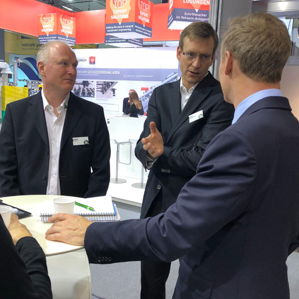
Newsroom
Discover Indium Corporation’s global communication initiatives and our latest media interviews.
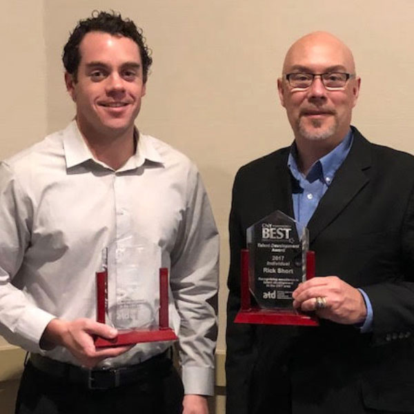
Corporate Awards
Our commitment to innovation and outstanding customer service consistently earn us recognition for our achievements in product development, process improvement, and management excellence.
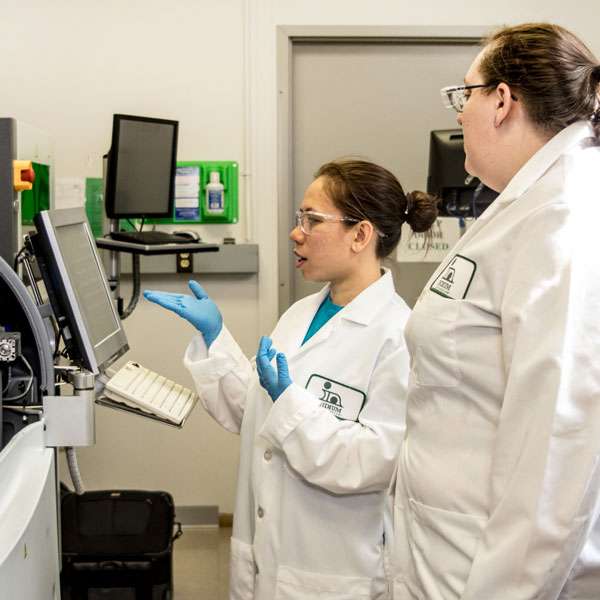
Technical Milestones
Fueled by curiosity and a commitment to changing the world through materials science, our journey embodies innovation and impact. We take pride in the recognition we have earned for our efforts, but we’re even more fulfilled by our contributions that will shape the future.
Video Library
Explore Indium Corporation’s diverse video library for firsthand insight into our products, applications, and technical expertise.

Webinars
Indium Corporation’s InSIDER Series is a complimentary webinar program aimed at making technical content accessible from anywhere.
Your Success
is Our Goal
Optimize your processes with the latest materials, technology, and expert application support. It all starts by connecting with our team.